今天遇到了这样一个问题,使用matplotlib绘制热图数组中横纵坐标自然是图片的像素排列顺序,
但是这样带来的问题就是画出来的x,y轴中坐标点的数据任然是x,y在数组中的下标,
实际中我们可能期望坐标点是其他的一个范围,如图:
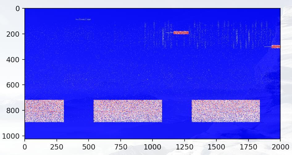
坐标点标出来的是实际数组中的下标,而我希望纵坐标是频率,横坐标是其他的范围
plt.yticks(np.arange(0, 1024, 100), np.arange(10000, 11024, 100))
#第一个参数表示原来的坐标范围,100是每隔100个点标出一次
#第二个参数表示将展示的坐标范围替换为新的范围,同样每隔100个点标出一次
plt.xticks(np.arange(0, 2000, 500), np.arange(0, 50000, 500))
#同理将x轴的表示范围由(0,2000)扩展到(0,50000)每隔500个点标出一次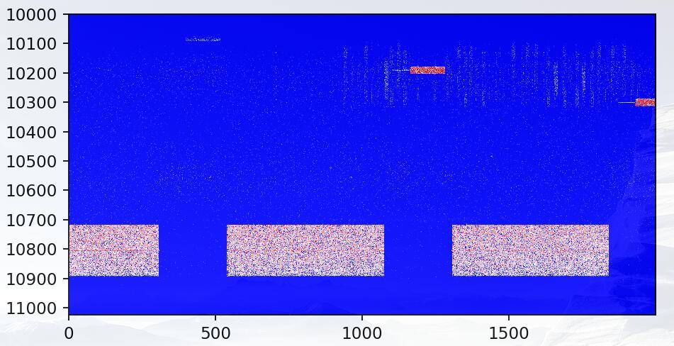
完成!
补充知识:matplotlib plt.scatter()中cmap用法
我就废话不多说了,还是直接看代码吧!
import numpy as np
import matplotlib.pyplot as plt


# Have colormaps separated into categories:
# http://matplotlib.org/examples/color/colormaps_reference.html
cmaps = [('Perceptually Uniform Sequential', [
      'viridis', 'plasma', 'inferno', 'magma']),
     ('Sequential', [
      'Greys', 'Purples', 'Blues', 'Greens', 'Oranges', 'Reds',
      'YlOrBr', 'YlOrRd', 'OrRd', 'PuRd', 'RdPu', 'BuPu',
      'GnBu', 'PuBu', 'YlGnBu', 'PuBuGn', 'BuGn', 'YlGn']),
     ('Sequential (2)', [
      'binary', 'gist_yarg', 'gist_gray', 'gray', 'bone', 'pink',
      'spring', 'summer', 'autumn', 'winter', 'cool', 'Wistia',
      'hot', 'afmhot', 'gist_heat', 'copper']),
     ('Diverging', [
      'PiYG', 'PRGn', 'BrBG', 'PuOr', 'RdGy', 'RdBu',
      'RdYlBu', 'RdYlGn', 'Spectral', 'coolwarm', 'bwr', 'seismic']),
     ('Qualitative', [
      'Pastel1', 'Pastel2', 'Paired', 'Accent',
      'Dark2', 'Set1', 'Set2', 'Set3',
      'tab10', 'tab20', 'tab20b', 'tab20c']),
     ('Miscellaneous', [
      'flag', 'prism', 'ocean', 'gist_earth', 'terrain', 'gist_stern',
      'gnuplot', 'gnuplot2', 'CMRmap', 'cubehelix', 'brg', 'hsv',
      'gist_rainbow', 'rainbow', 'jet', 'nipy_spectral', 'gist_ncar'])]


nrows = max(len(cmap_list) for cmap_category, cmap_list in cmaps)
gradient = np.linspace(0, 1, 256)
gradient = np.vstack((gradient, gradient))


def plot_color_gradients(cmap_category, cmap_list, nrows):
  fig, axes = plt.subplots(nrows=nrows)
  fig.subplots_adjust(top=0.95, bottom=0.01, left=0.2, right=0.99)
  axes[0].set_title(cmap_category + ' colormaps', fontsize=14)

  for ax, name in zip(axes, cmap_list):
    ax.imshow(gradient, aspect='auto', cmap=plt.get_cmap(name))
    pos = list(ax.get_position().bounds)
    x_text = pos[0] - 0.01
    y_text = pos[1] + pos[3]/2.
    fig.text(x_text, y_text, name, va='center', ha='right', fontsize=10)

  # Turn off *all* ticks & spines, not just the ones with colormaps.
  for ax in axes:
    ax.set_axis_off()


for cmap_category, cmap_list in cmaps:
  plot_color_gradients(cmap_category, cmap_list, nrows)

#十分类散点图绘制
randlabel = np.random.randint(0,1,10)
randdata = np.reshape(np.random.rand(10*2),(10,2))


cm = plt.cm.get_cmap('RdYlBu')
z = randlabel
sc = plt.scatter(randdata[:,0], randdata[:,1], c=z, vmin=0, vmax=10, s=35,edgecolors='k', cmap=cm)
plt.colorbar(sc)
plt.show()
以上这篇python matplotlib imshow热图坐标替换/映射实例就是小编分享给大家的全部内容了,希望能给大家一个参考,也希望大家多多支持python博客。
-
<< 上一篇 下一篇 >>
标签:numpy matplotlib
python matplotlib imshow热图坐标替换/映射实例
看: 1817次 时间:2020-08-02 分类 : 数据分析
- 相关文章
- 2021-12-20python数据挖掘使用Evidently创建机器学习模型仪表板
- 2021-12-20Python多进程共享numpy 数组的方法
- 2021-12-20python数据分析近年比特币价格涨幅趋势分布
- 2021-12-20python调用matlab的方法详解
- 2021-12-20python学习与数据挖掘应知应会的十大终端命令
- 2021-07-20pandas中NaN缺失值的处理方法
- 2021-07-20Python数据分析入门之数据读取与存储
- 2021-07-20Python 如何读取字典的所有键-值对
- 2021-07-20如何获取numpy的第一个非0元素索引
- 2021-07-20Python机器学习之KNN近邻算法
-
搜索
-
-
推荐资源
-
Powered By python教程网 鲁ICP备18013710号
python博客 - 小白学python最友好的网站!